Celebrating musical heritage with Keaykolour

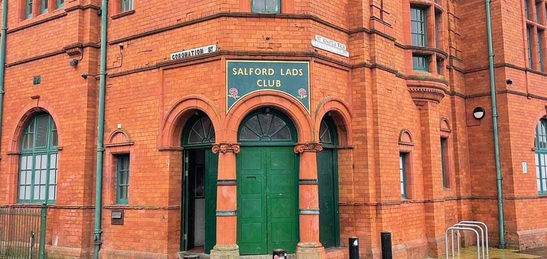
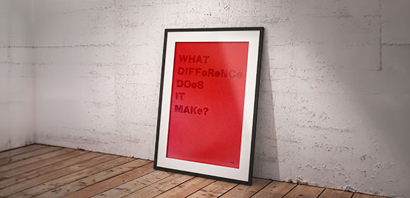
Some projects mean more because of the story behind them. This is one of those pieces. Designer Peter Wright of Base Creative was invited to revisit a letterpress poster he first created during his Master’s degree. The original design was made in recognition of the volunteers at Salford Lads Club, and this new limited-edition run brings that idea back to life in a way that feels both timely and meaningful.
Some projects mean more because of the story behind them. This is one of those pieces. Designer Peter Wright of Base Creative was invited to revisit a letterpress poster he first created during his Master’s degree. The original design was made in recognition of the volunteers at Salford Lads Club, and this new limited-edition run brings that idea back to life in a way that feels both timely and meaningful.
Salford Lads Club is a building with real cultural weight. It has long been an important part of the local community, but it is also known far beyond Salford because of its connection to The Smiths. The photograph used on the inner sleeve of The Queen Is Dead was taken outside the club, making it a place of pilgrimage for music fans as well as a valued community landmark.
With the album reaching its 40th anniversary, the project feels especially relevant. It connects graphic design with music history and places them together in a way that is simple, honest and full of character.
The creative approach
For this edition, Peter chose to produce the poster using letterpress. It is a process that suits the subject perfectly. There is a sense of care and permanence in letterpress that digital methods cannot quite replicate, and that physical impression on the sheet gives the work an added depth.
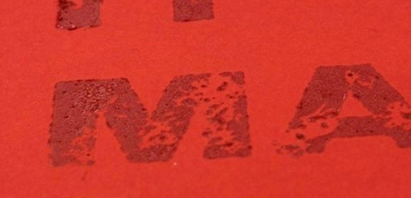
The choice of paper played an important role in that result. Peter selected Keaykolour 300gsm in Pumpkin and Chili Pepper, two shades that bring warmth, confidence and a strong visual presence to the finished piece. The paper’s weight and surface work beautifully with letterpress, helping to give the poster a tactile quality that feels considered and lasting.
Rather than overpowering the design, the stock supports it. It adds richness, enhances the print finish and gives the work the kind of substance you want from a limited-edition poster.
Why Keaykolour worked
For designers, paper is never just a background. It shapes the entire experience of a piece, from first impression to how it feels in the hand.
Keaykolour was a fitting choice here because it brings together colour, character and a sense of quality. The boldness of Pumpkin and Chili Pepper gives the poster an immediacy that suits both the subject matter and the print process, while the heavier 300gsm weight adds presence and durability.
It is the kind of stock that invites close attention, which feels right for a project rooted in craft, memory and cultural significance.
The impact
There is also a practical purpose behind the work. The limited-edition posters will be signed by Peter Wright and sold through Salford Lads Club, with proceeds going towards the upkeep of the building.
That means the poster does more than commemorate a place with a rich history. It also contributes to its future. For supporters, it offers the chance to own a thoughtfully produced piece of print while helping preserve a landmark that continues to matter to both the community and music fans alike.
Closing thought
This project is a good example of how material choice can strengthen an idea. With the right process and the right paper, a poster becomes more than a printed object. It becomes something people want to keep.
By pairing letterpress with Keaykolour, Peter Wright has created a piece that feels grounded, expressive and enduring, exactly the qualities the subject deserves.