


The impact of Typography on the Art World


Typography is hugely important to how we perceive art and design. This blog explores the impact of typography on the art world.
Typography is hugely important to how we perceive art and design. This blog explores the impact of typography on the art world.
Did you know that… Typography has a powerful impact on the art world?
In art and design, every choice makes a difference. Often, seemingly small details can drastically alter our emotional reactions. As an artistic tool, typography is often overlooked or dismissed. However, our perception of an artwork or a piece of graphic design is greatly affected by the typography the artist or designer uses.
When thinking about typography, you might assume that it is a simply functional decision. Many people believe that all typography does is allow designers and artists to convey messages clearly and effectively. But by concentrating on typography, we can develop a deeper and more nuanced appreciation for art and design.
Just like colour, composition, and form, typography contributes to the overall visual aesthetics of a piece or project. A well-chosen font can change the mood or tone of an artwork and help to engage the viewer in a deeper conceptual dialogue.
In this article, we’ll look at the importance of typography and how modern and contemporary artists are using fonts to create striking, beautiful, and challenging artworks.
What is Typography, and how does it impact Art and Design?
Typography is a vital tool in art and design and is essential for written communication. Typography also helps to establish the visual style and cultural context of a piece of writing, artwork, or graphic design. The right typography allows art to speak more clearly and deeply while supporting the broader narrative or concept the artist wishes to convey.
But what is typography exactly? Simply, typography is the art and technique of arranging type. Typography incorporates stylistic families of letters and numbers, known as typefaces. Typefaces are further broken down into fonts, which are variations of a typeface.
The selection and arrangement of typefaces and fonts have a massive impact on how we perceive and react to artworks. Typography affects the readability of a message and establishes cultural context, meaning, and mood.
How modern and contemporary artists use typography
Modern and contemporary artists have continually explored the many ways typography can be used to create beautiful, evocative, and sometimes challenging artworks. The below artists are known for their explorations of the creative potential of typography.
Herb Lubalin
The American graphic designer and typographer Herb Lubalin was a pioneer in the use of lettering to express concepts and elicit emotional responses from the viewer. Lubalin began his career as a freelancer, creating graphic art for books and magazines. His artistic flair began to shine when he took a position as art director for the Sudler & Henessey advertising agency.
Lubalin focused on the then-revolutionary idea of presenting words as images, transforming letterforms into art and blending typography with illustration.
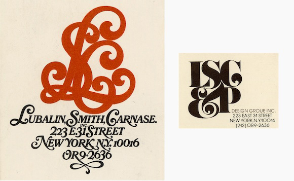 Logos of Herb Lubalin's graphic design studio between 1967 and 1978.
Credit : Herb Lubalin
Lubalin created a number of iconic typefaces, spearheaded a new era of American advertising, and changed the direction of modern graphic design.
Paula Scher
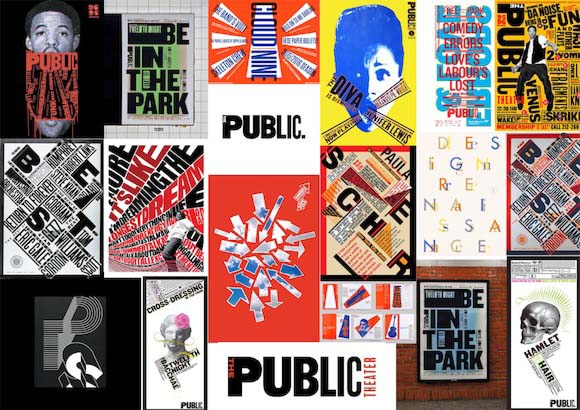 Example of work looked at for the designer Paula Scher
Credit : Paula Scher
Paula Scher is a world-renowned graphic designer famous for her innovative use of typography in large-scale public projects. She uses typography to blur the lines between pop culture and fine art. Her work features playful, dynamic lettering combined with bold visual compositions.
Scher uses unconventional spacing, blending various font colours and weights and incorporating rare or historically significant typefaces. Some of her most well-known work includes the logos for CNN, Citibank, and Microsoft Windows, as well as large-scale installations, such as her mural for the Public Theater in New York.
Stefan Sagmeister
Often referred to as the ‘bad boy’ of the typography world, Stefan Sagmeister pushes the boundaries by incorporating lettering into his often confrontational art pieces. Sagmeister uses text in interactive art, public installations, and album covers and explores themes of self-reflection and identity.
Sagmeister gained considerable notoriety when he carved text into his naked body for a poster for an AIGA event and dangled himself out of a window for a scene in a short typography film. His work has been used for album covers by influential musicians such as the Rolling Stones and Lou Reed.