


Design for good – a force for Feminism


Feminism is a force to be reckoned with. In recent years, on the heels of the Women’s March and the Me Too movement, we are reminded once again of the power of women to make changes in the world. While feminism has come a long way from the days of suffragette posters and Rosie the Riveter’s “We Can Do It!” flex, graphic design continues to play a poignant part in advancing women’s issues through bold and convincing imagery.
Feminism is a force to be reckoned with. In recent years, on the heels of the Women’s March and the Me Too movement, we are reminded once again of the power of women to make changes in the world. While feminism has come a long way from the days of suffragette posters and Rosie the Riveter’s “We Can Do It!” flex, graphic design continues to play a poignant part in advancing women’s issues through bold and convincing imagery.
And with good reason, because headlines across the world remind us that there is still work to be done to achieve equality for women. Everyday activists continue to carve out a place in history for women to forge their future, and as with all societal movements communication is key. Women and men alike continue to lend their creativity to the female cause with eye catching designs making waves in media and minds across the world, and swaying public opinion through visuals with mass appeal. In its current wave, with a focus on intersectionality, queer, non-binary, and non-white experiences, new designs have emerged to speak up for new voices alongside all women. For the occasion of International Women’s Day, let us shine a spotlight on poignant graphic design addressing equality for women around the world. From surprising to approachable, and from bold to beautiful, one thing is for sure: these designs make a difference, as a force for feminism, with a goal for good.
"Woman Interrupted: Portrait of Silence" by BETC

"Woman Interrupted: Portrait of Silence" by BETC
As you might recall, during the first U.S. presidential debate, Donald J. Trump interrupted Hillary Clinton 51 times. Clinton interrupted him only nine times. This behaviour has since been coined as manterruption, falling somewhere on the spectrum of sexist behaviour right next to mansplaining. It is widespread in boardroom meetings, but is all too common outside of the professional world as well. Women want to be heard and it’s time we start listening to them, fully. So for International Women’s Day, the Brazilian advertising agency BETC asked female artists from around the world to rally around the issue and design posters about manterruption. Contributors from every continent created the series titled “Women Interrupted: A Portrait of Silence.”
67 artists from more than 20 countries, under the art direction of José Pedro Bortolini, donated illustrations - amounting to 87 unique posters. The poster series used the same colour codes to unify the unique images across the campaign. Each poster featured an original portrait or self-portrait of a woman being silenced with a man’s finger in front of her mouth, to show that a woman interrupted is a woman silenced. The portraits are as diverse as the artists themselves. Beside each are various captions by copywriter Nathalie Lourenço such as “Women being heard. That sounds pretty good.” and “After the right of free speech, we want the right of full speech.” These thought-provoking captions send the impactful message that women are fed up with having to fight for airwaves.". Other captions read “Stop talking and start listening.” and “Equal rights means equal voices.”, driving home the issue that all voices are born equal and should be treated so. The series was so well received that BETC decided to open submissions for Portraits of Silence Series 2.
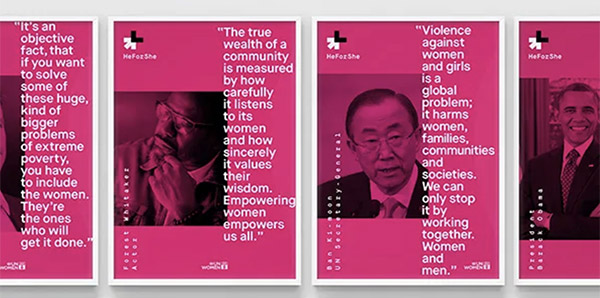
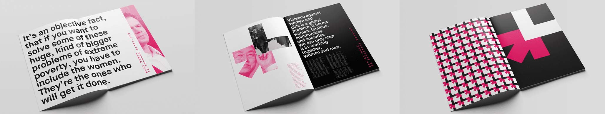
HeForShe by DIA for the United Nations
In the age of inter-sectionalism and identity, we hear a lot about allies. The patriarchy is most often to blame for inequality between the sexes, but men can also be a force for positive change for women. The United Nations HeForShe campaign is about just that, how men can be allies for women. The solidarity movement on gender equality brings together one half of humanity in support of the other half, for the benefit of all. HeForShe seeks to involve men and boys across the globe in achieving equality by taking action against negative gender stereotypes and behaviours. Since its launch in 2013, men from around the world including Heads of State, CEOs and global luminaries have joined millions of others in signing the #IDo #HeForShe pledge to fight for gender equality.
“For All Womankind” by Deva Pardue

“For All Womankind” by Deva Pardue
For most of us, it would be almost impossible to not have come across Deva Pardue’s femme fist, officially titled For All Womankind, the same name as the designer’s feminist forward organisation. What began as a free download for the Women’s March, would soon become one the most recognisable designs of the last decade, symbolising much more than the sum of its parts. After the election of Donald J Trump, many women felt let down by politics and the promise of women’s rights, subsequently inspiring them to march and stand up for their rights. New York based and Irish born designer, Deva Pardue, created the femme fist as a free downloadable poster for the march. It went viral during the lead-up to the protest being shared by celebrities. 4,000 people in the U.S. alone downloaded free PDFs of the design, to print for the march. The online sale of prints has since raised over 25,000 dollars to benefit two non-profits advancing reproductive freedoms in the States.
Pardue’s design resonated with women of all kinds. The poster design encapsulates the intersectionality of modern-day feminism. The name "For All Womankind" refers, according to Pardue, to the need for intersectionality in organising across issues of gender and race, and beyond the level of campaigning for individual rights. Faced by a lack of feminist design representing the diversity of women, Pardue decided to create one herself. “When it comes to protest art, the importance of immediacy can’t be underestimated. Saying something with as little clutter as possible resonates the most,” said Pardue. With this in mind, she created a design that was as soft and feminine as it is strong and diverse. Her motif of three raised fists, each with a different skin tone but the same painted red fingernails, is posed on a powder pink background, making it as unapologetically feminine as it is assertive. Perdue’s femme fist continues to grow in popularity, having been seen in women’s movements across the globe and reinterpreted by dozens of other artists. It continues spreading the message of an inclusive feminism and inspiring women to continue the fight for their rights.
The Feminist Library’s fund-raising campaign

Can a typeface help save feminism? Well, a team of designers thought it could. The Feminist Library in south-east London boasts an incomparable collection of over 7,000 books, 1,500 periodical titles from around the world, several archives of feminist individuals and organisations, pamphlets, papers, posters and ephemera. For nearly 40 years the library operated without interruption as an archive and cultural centre for women. Suddenly in 2018, news broke that the local council had decided to develop the library’s building. Despite being offered another space in another neighbourhood, the library needed to raise the sum of £48,000 in order to not only move all of its books, but turn its new home into a functioning library and community space. As a result, a team of designers were brought together to develop an identity that would support the crowdfunding campaign to save the feminist archive and community space.

Fundraising posters featuring Sanderson and Lincoln’s original typeface
Together, designers Lucy Sanderson and Anna Lincoln started by developing a unique and eye-catching typeface inspired by the library’s own archive of feminist protest banners. In order to create it, they produced large-scale letterforms with tape across tables at a local pub, and then scanned them to create a digital version to be implemented into the fundraising posters and flyers. The low cost method was paramount for the designers, insisting that they wanted it to have a certain accessibility in line with the values of the library itself. Paired with bright coloured geometric backgrounds and sometimes layers over abstracted version of the scanned tape designs themselves, the typeface stands out to be read loud and clear. The eye catching designs were a success, garnering enough attention to raise the necessary funds and more to save The Feminist Library so it could continue to make women’s stories accessible and cultivate a community where feminism can thrive. Furthermore, the new typeface was such a success they decided to keep it for the new logo for The Feminist Library.
The future is feminist
While graphic design may not be the first thing that comes to mind when we think about fighting for feminist causes, history has proven that thoughtful design can lead to a powerful impact. These poignant campaigns show the difference that design for a cause is capable of making. As long as there is progress to be made, designers can continue to use their creativity for good.