


OLIN ORIGINS - A peek into Carlin’s creation process for the line


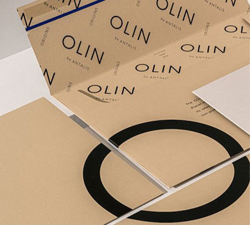
A world-renowned colour specialist, Carlin, has been central to the development of the Olin Origins range. Aiming to reinvent the “kraft” concept for a premium paper, Olin Origins is available in five colours: Chalk, Cereal, Pebble, Indigo and Lava stone. We met with Natalie Weinmann, Lifestyle and Innovation Designer, and Sophie Chapotat, Artistic Director, both working at the agency, to talk about how the concept and colours were conceived. Here is a small extract of the interview.
A world-renowned colour specialist, Carlin, has been central to the development of the Olin Origins range. Aiming to reinvent the “kraft” concept for a premium paper, Olin Origins is available in five colours: Chalk, Cereal, Pebble, Indigo and Lava stone. We met with Natalie Weinmann, Lifestyle and Innovation Designer, and Sophie Chapotat, Artistic Director, both working at the agency, to talk about how the concept and colours were conceived. Here is a small extract of the interview.
“There is a real demand on the market for a range of “kraft” papers. A need for authenticity and respect for nature.”
Natalie Weinmann
What was, for you, at the centre of the project?
Natalie Weinmann: There is a real demand on the market for a range of "Kraft" papers. A need for authenticity and respect for nature. We focused a lot on this aspect of natural origin, to work on the concept of naturalness that we defined as vital and powerful but at the same time gentle and benevolent, we called this range “Origins”.
Sophie Chapotat: We didn’t want to work on a lush vision of nature, but something that mixes a raw and soft feeling. We drew on mineral and plant inspirations for both the texture and the colours, for a very elegant result.
For whom did you design the range?
N.W: We created it to meet the demands of a fairly epicurean clientele, makers, eco-conscious craftsmen who seek a range of paper that is fairly accessible in terms of price, but which has a real character, a real personality and which is versatile enough to be used by someone in the food industry, boutique hotels or wellness brands.
Where do you find inspiration to develop new colours?

Olin Origins waterfall and tools
N.W: We look for inspiration on multiple media because the material, the look and the texture are very important to us, but as far as colour research is concerned, we work with the help of screen prints specially made for Carlin. We have a huge colour library to be able to match our clients’ requests to the exact shade and to find the right tone.
“For us, what links them all together is this concept of aesthetic naturality.”
Sophie Chapotat

Olin Origins colour range concept by Design & Practice
How did you approach the colour development of Olin Origins?

Olin Origins Cereal
Inspirational card
S.C: What was really important for us was to have a range of colours that worked by themselves, that each had a strong personality, but also could work together. For us, what links them all together is this concept of aesthetic naturality.
N.W: It is all about balance, when you take Chalk for example, which is an off white, it is sober, yet not cold, and has lots of texture. It is not an optic white, but neither a yellowish one.
Natalie, do you have a favourite shade?
N.W: I really love them all, of course, but if I have to choose one, I'm partial to Indigo, which wasn't a colour originally intended for the range. It's a shade that brings real colour to a range that is rather neutral but also remains temperate and in line with the other colours. It's a colour that refers to denim, a heritage that we all have a bit in common. Yes, I have a soft spot for it.

Olin Origins indigo within the sample folder (left), and as inspirational cards (right)
And you Sophie?
S.C: Cereals, because it was a real challenge to develop it. It is a colour that is central to all “Kraft” ranges, and often we see flaws in the colour, that can move towards green or yellow. I am very proud of its contemporary quality and its modernity, its accuracy.
Video Interview
Watch the full video interview here