


Antalis vs The Brand Identity: The A-Paper Part III


Continuing The Brand Identity’s partnership with Antalis Creative Power, The A Paper explores the often neglected and undervalued topics within the contemporary graphic design scene. For part three, we look towards publishing, speaking with Counter-Print, magCulture and Draw Down to discuss what the future holds for the industry, and which publications are leading the way.
Continuing The Brand Identity’s partnership with Antalis Creative Power, The A Paper explores the often neglected and undervalued topics within the contemporary graphic design scene. For part three, we look towards publishing, speaking with Counter-Print, magCulture and Draw Down to discuss what the future holds for the industry, and which publications are leading the way.
Counter-Print
UK-based independent online book store Counter-Print, founded by Céline Leterme and Jon Dowling, first emerged in 2008 and has garnered a reputation as the purveyor of the greatest art and design books available. Having been exposed to the publishing industry’s most exciting and forward-thinking output for over a decade, we spoke to them to garner their insight on where the industry is now, the path it took to get there, and where it could be heading.
“When physical books were first challenged by e-books, the accepted wisdom was that printed books would retain their popularity if they were beautiful items to own,” Dowling tells us, noting how the future seemed to be full of fancy finishings, limited runs and coffee table art books – this was, however, not the case. “We have seen a real trend in the opposite direction, much to our surprise,” Dowling explains, citing the increased popularity of long form design writing and “in particular”, he adds, “books offering career advice becoming much more popular with our audience.”
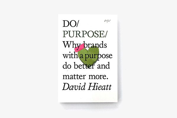
Do Purpose – one of 30+ books in Miranda West’s series
With the rise in introspection and community-knowledge potentially due to ambivalence, apprehension, and anxiety that dutifully co-exists with the increasingly digital and eternally active 21st-century culture; the ongoing pandemic – along with the “uncertain times we are living in, globally, locally and personally,” as Dowling describes – has assuredly contributed to this innate draw. “I think readers might be looking for certainty in very uncertain times,” Dowling tells us, “someone or something to help guide and navigate them through life and live it with a sense of purpose,” as well as the sense of security felt from receiving advice from a published book.
“Empowering books that offer advice on careers such as ‘F*ck Being Humble or ‘Don’t Get a Job Make a Job’ has outstripped, in sales at least, the ‘design classics,’” Dowling explains, the offerings of which tended to be very visually led. Describing The School of Life – specifically The Emotionally Intelligent Office – and Do Book Co. books series as not only notable but leading figures in this shift, there seems to also be a continuity of clarity across these two series, be it design clarity or clarity in intention.
“The School of Life liked the feel of 1960s Swiss graphic design, so I developed some ideas that felt much more modernist and spare,” the designer behind The Emotionally Intelligent Office Marcia Mihotich tells us, recalling her contextual approach to book design. “I often start by thinking how this particular book can stand out,” she adds, looking to see what similar competition are and aren’t doing. “I do try to reflect the subject and meaning in the choices of typeface and layout,” Mihotich reveals, noting the significance of a book’s tactility. “That’s what makes it meaningful,” she adds.
Similarly, founder of The Do Book Co. Miranda West explains “pretty much all our marketing budget goes on the look and feel of the books,” expounding the additional cost as a sincere investment, and highlighting the significance of a book’s design past the cover. “We publish evergreen content, so we want the books to be read and reread over time,” West adds, exhibiting the importance of the writing and again demonstrating the prominence of clarity in what they do – having a distinct identity and direction from the get-go.
“The aim was to publish a branded series of inspirational pocket guides,” West recalls, “and as the books are physically small, we knew the design needed impact.” As a result, West called on designer James Victore to design the first five books in the series to set the graphic and physical tone of them. “The designs he sent through were completely unexpected,” West concludes, “the stark white covers, seemingly naive artworks and elegant typography created a bold, iconic collection that literally stands out in a bookstore.”
Draw Down
Across the pond in the United States, Draw Down is an independent shop and publisher of books from the world of education, graphic design, typography, illustration, photography, art, and architecture. Due to being publishers of small-run books themselves, Draw Down’s experience of artist and designer books, as well as the relationship to their more commercial counterparts, is unmatched. “At Draw Down, the titles that show where publishing, at least in the design sector, is heading are the publications that are doing particularly well at the moment,” co-founder of Draw Down Kathleen Sleboda explains. “They're lodestones that indicate future trends,” she adds, “and also showcase longer-term trends we've observed as booksellers,” especially in terms of the specific content, pricing, and design – noting that “there's a matrix of qualities at play for any particular title.”
With a long shelf-life and a likelihood to be continually in demand, Sleboda suggests Graphic Design Rules as a trend-setter for the future of publishing, noting its dual life as a single-read book and as a future reference piece, which is also more budget-friendly as a result. “Books that are aspirational in some way, that equip people with skills, technical know-how, theoretical knowledge,” Sleboda describes, “are going to remain mainstays in design publishing;” in doing so suggesting that the future of publishing may well be the content that remains at the industry’s core, rather than the books that try to push it in another direction.
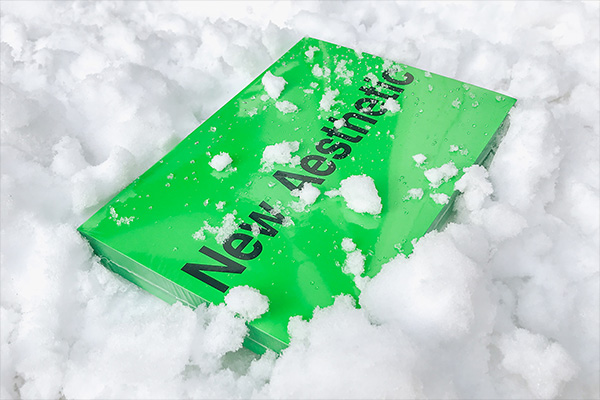
Sorry Press, Leonhard Laupichler and Sophia Brinkgerd’s New Aesthetic 2
Sleboda also suggests New Aesthetic 2, a curated anthology of the typographic industry’s vanguard typefaces and type designers. “A book like New Aesthetic 2 is eye candy, for sure – slick, glossy, neon green, tactile,” Sleboda explains, “but the contents are rich with information that can be referred to time and time again,” she adds, “and the typographic experimentation serves as visual inspiration.” Truly setting itself apart as not only a paragon of contemporary design but also the purveyor of such, Sleboda suggests “anthologies of work are also the type of designerly print books that remain a viable resource once purchased and examined.”
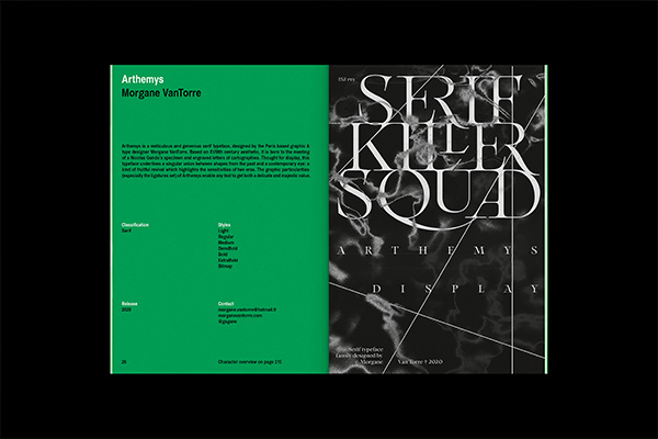
Morgane VanTorre’s typeface Arthemys within New Aesthetic 2
In conversation with New Aesthetic 2’s creators and designers Leonhard Laupichler and Sophia Brinkgerd, they explain “our vision was to create a collection of typographic artworks and typefaces, as a sort of time capsule,” that “would not only look great on a coffee table, or as a collector’s item, but also invite you to revisit it at any time and flip through.” Questioning whether the drive for originality was a prominent thought in the design of the book, as well as its construction, the dynamic duo note that “one of our main beliefs is that typography holds the power to speak for itself through form and its design.” With this in mind, they fully understand the playful exploration of design and “pushing the boundaries of visual communication” through the medium of experimental typographic design. “Our way to translate this into the book design was that we would create a stage, a frame of display for the typefaces we curated,” the duo explain, “the book speaks equally through both its vibrant colour and minimal layout design,” they conclude, exhibiting not only the relevance of each type designer’s work but also its artistic value and culture importance.
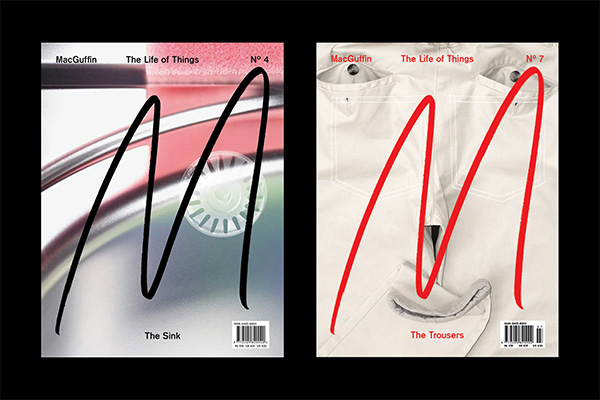
Kirsten Algera and Ernst van der Hoeven’s MacGuffin magazine
MagCulture
Launched initially as a blog in 2006, London-based magazine shop, events producer and online resource magCulture are a celebrant of editorial creativity, forever head-first in the latest and greatest offerings from independent publishing and the expression of self through printed means.
Considering what the future holds for publishing, founder of magCulture Jeremy Leslie looks towards serial publications, highlighting Buffalo Zine – the biannual fashion magazine – as a prime example. “It changes format and theme every issue,” he explains, “revelling in the joy of print and producing fashion coverage of the highest order while taking the p*ss out of the whole scene,” showing not only self-awareness of the industry, but also themselves within it. “As a result, it feels genuine,” Leslie adds. This somewhat suggests the flexibility, or even total laxity, of publishing to come, whereby publications and books have the freedom or expectation to continually chop, change and shift focus – contrary to the consistency of The Do Book Co. or The School of Life.
Another contender for the future of publishing is Real Review, a magazine series from the mind of Jack Self. “Every issue is a brilliant selection of writing around the idea of ‘what it is to live today,’” Leslie explains, written, printed and presented in a way that is equally as striking as it is accessible. Although suggesting that it’s the ease of accessibility behind Real Review that places it at the forefront of publishing, the opposite could be said for MacGuffin. “The rise of the niche magazine!” he exclaims, showing his enthusiasm for the Dutch magazine that, each issue, takes a deep-dive into a specific familiar item – ranging from trousers and drawers to the ball and the sink.
“When we pitched the idea of a themed magazine about the life of one single object everybody thought we were crazy,” MacGuffin’s Editors-in-Chief Ernst van der Hoeven and Kirsten Algeraand explain, being instead advised to take the project online or curate an exhibition in its place. “Back in 2015, printed matter was declared dead,” they explain, asking “why then sacrifice all these trees?” Driven by the challenge to make something comprehensively researched, tactical and durable, however, they pressed ahead. “Funny enough our way of working doesn’t differ much from curating an exhibition in the end,” they note, “but the good thing about a magazine is that it is mobile and can reach a large audience.”
Champions of autonomy and experimentation in print, MacGuffin’s editorial design perfectly balances graphic eccentricity and typographic mastery – deliberately fearless in the execution of ideas, and incredibly aware of their actions in doing so. “Our editorial model is rather kaleidoscopic,” the duo explain, “we like to see the world through the lens of the object featuring as many disciplines and perspectives as possible,” manifesting in an exciting, adventurous and incredibly engaging reading experience.
——
For more articles and explorations into creativity, head over to: