


Mix & Match - When graphic designers play with colour


As a fashion trend, mix & match has been around for decades. With the rise of Instagram's fashion bloggers and their search for unique styles, mix & match has become so important that it has invaded the catwalks in recent years, right up to the latest fashion shows. Favoured by the use of social media, the trend has spread to interior design, where vintage Scandinavian furniture can be found alongside Ikea carpets. Mix & match is a joyful game of experimentation that concerns all areas related to image, whether it is that of a person or a brand. Graphic design is no exception today.
As a fashion trend, mix & match has been around for decades. With the rise of Instagram's fashion bloggers and their search for unique styles, mix & match has become so important that it has invaded the catwalks in recent years, right up to the latest fashion shows. Favoured by the use of social media, the trend has spread to interior design, where vintage Scandinavian furniture can be found alongside Ikea carpets. Mix & match is a joyful game of experimentation that concerns all areas related to image, whether it is that of a person or a brand. Graphic design is no exception today.
_________________
“(…) that's the thing about mixing and matching - there are a lot of happy accidents.”Jaako Tuomivara
_________________
According to senior Graphic Designer Jaako Tuomivara (Supergroup Studios), it is the use of computers that allowed graphic designers to really access the game of mix & match. As he himself explains, “the horrible and beautiful thing about the computer is that it flattens everything”.
On the one hand, the continuous use of computers has made this flatness acceptable to everyone, even for 3D objects. When everything is put on the same level, it is easy to play with different elements, such as photographs, illustrations and text, and to assemble them. But more importantly, computer screens have been a revolutionary tool, where what you have on screen is as close as possible to the result on paper. As he explains in more detail, “the closer you move to the final outputs in whatever you're working on, the easier it makes it for you to throw in everything and anything and try them out, because that's the thing about mixing and matching - there are a lot of happy accidents”.
Playing with creative paper
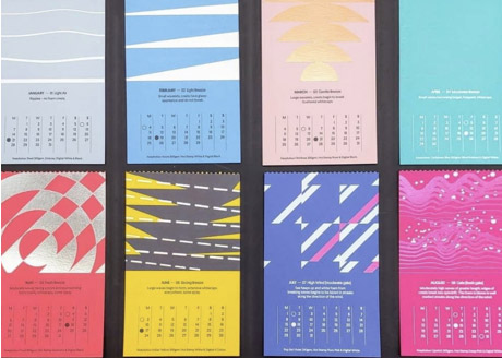
Mix & match is all about personalised communication. In previous articles we have discussed the influence of texture and colour in communication on paper, the main argument being that these two elements deliver messages by themselves. For example, research shows that thick paper can give an idea of quality, or that blue can create a sense of reliability. But what happens when we mix colours or textures? To learn more, we asked Eric Guillouard, designer, co-owner of the Atelier 3D couleur agency to help us understand.
_________________
“It is better to avoid a clash of colours, hot versus cold, unless they are of equal value."
Eric Guillouard
_________________

restaurant by A-Side studio on
Keaykolour and Pop’Set (UK)

of Nowmatters on Keaykolour and
Curious Metallics (Hong Kong)

on Curious Alchemy, Curious Metallics,
Skin Curious Collection and Keaykolour (Hong Kong)
The agency, who collaborates with companies like Hermès, Airbus and Philips, was also tasked with developing the colour ranges of Arjowiggins Creative Papers. Inspired by what is already being done using paint in interior decor, in 2018 they totally revamped their portfolio where the principle of mix & match applies to creative papers. In his own words “our concept gives graphic designers the possibility, within rich ranges, to freely associate colours in the knowledge that all colour association choices will work. It is what we call a "harmonised range". Arjowiggins then launched in February 2021 Keaykolour and Curious Metallics tools to help them to mix and match colours to the infinite.
When asked for advice on matching colours, he answers with some simple rules: “An obvious tip, to stay on the safe side, is to work in monochrome. If you are looking for contrast, you should favour a very strong contrast, with a very light tone combined with a very dark one. However, it is better to avoid a clash of colours, hot versus cold, unless they are of equal value. For example, if you take a pastel green with a dark orange, it probably won't work.
If we take a project like a book, or catalogue, for example, you basically have four choices. The first one is classic, namely to use a light-coloured cover with light-coloured pages. Working with neutral colours can be very elegant. A second possibility is to use a dark colour on the cover, which will be made spectacular by a light interior. A third possibility, which is that of chromatic shock, will have a very strong impact. The last possibility, which seems very modern to me, but not explored a lot, is that of a light, classic cover with coloured pages. The challenge, of course, is to manage to print over colour while remaining easily readable, but I think this is an interesting approach.”
Designed by A-side Studio on Keaykolour and Pop’Set (UK)

Mix & match is above all freedom of creation, rendering each creation unique. In a social media era, where personality is a selling point, mix & match allows designers to create unique assignments that permits projects to embody the personality of the individual who created them.
Jérôme Noyelle, Antalis Market Development Manager for Fine Papers, explains “to add differentiation to a print project, designers can mix various colours from one or two paper ranges allowing them to create a collection effect and to have a stronger visual impact. In addition, print techniques like screen-printing, embossing or hot stamping can allow mixing coloured paper without increasing the production costs. That can also be achieved with offset printing if the coloured papers have the same intensity; otherwise some ink adjustments may be needed to have the same readability”
Whether it is colours or textures, the interaction of elements multiplies the possibilities to deliver a finely tuned message. In the field of interior design, paint manufacturers have well understood that, as they started creating fabric with colours matching their paint.
Creating and mixing typefaces
What is fascinating about mix & match in the design field is how it implies that a group of creative people channel their creativity into a given frame. Other collaborators can add further creativity such as colourists and graphic designers. The process starts with mixing and matching various elements inside that frame, so that mix & match is both an input and an output of that process.

on Keaykolour and Curious Metallics (Russia)

on Curious Metallics (France)
Type design is a perfect example of that. Tom Foley, Creative Type Director for Monotype, talks about his work and influences in the type field. “Type design has always been a reflection of wider movements in culture, whether it is technological, cultural or even commercial. If you take the Victorian era, which is seen like a golden age of type, a lot of it was driven by improvements in printing, or the rise of consumer culture.
Those ideas still apply today. An awful lot of what you see in novel types today is driven by big brands, where customer typefaces are made for them. They create both a trend towards commercially acceptable types, which at the moment is sans serif typefaces and you get the backlash to that trend, which is much more experimental, kind of genre pushing designs”. Regarding technological opportunities, he mentions two examples causing major changes in the past decades. The first one is the creation of the variable font technology, which allows designers to store an infinite number of fonts for a same typeface in a single file, thus improving adaptability (see illustration).
The other one is the open type technology, which can accommodate up to 65,536 glyphs. This allows for improved flexibility in handwritten fonts for example, as a same letter can be attached to the following one in different ways. This made possible the creation of complex hand-written fonts in non-Latin alphabets. These influences have allowed for a large variety of typefaces to be created.
_________________
“You can successfully mix sans serif and a script typeface provided you follow certain rules (…).”
Tom Foley
_________________

to create an almost infinite variety of styles
When asked for advice on mixing typefaces, Tom Foley believes that the usual typeface classification (by period or style) might be outdated, as we live in an age where people mix influences from different periods. “What is important for successful typeface matching isn't that they have to come from the same genre, the same time or the same style. You can successfully mix sans serif and a script typeface provided you follow certain rules and they are always quite pragmatic.
I use calligraphy as a kind of fundamental basis for this idea of comparing typefaces, because typefaces today are derived from calligraphic forms. If you understand them, you can make better choices. When it comes to type design there's two main types of calligraphy that are really important, which are broad nib and pointed nib, so you can make a typeface family which has a sans serif and a serif that can work really well together provided you follow those calligraphic principles that bind them”. The Macklin typeface, designed by Monotype is a great example of that.

Macklin™ Superfamily by Malou Verlomme of the Monotype Studio.
Talking about the need for personalised communication, it seems clear that there is a growing need for new brands, often challengers, to have access to tools that allow non-designer professionals to create professional looking brands. These tools, created by UX and graphic designers, are expanding to new fields, and collections of typefaces designed to work following a mix & match principle are already beginning to appear. However, as Foley underlines, these collections are meant to become mainstream, and lose some of their personality, making creative professionals a much-needed element.
The art of mixing & matching is a question of taste and subjectivity; it requires experience, both successful and unsuccessful. But above all, if all the people we interviewed agreed on something, it is that mix & match is a creative game, it is fun and abolishes frontiers, which might be just what we need in these times.

Explore colour combinations with the
Keaykolour and Curious Metallics ranges

Curious Collection Metallics Peacock
match perfectly with Keaykolour Atoll