
The winners of The Cut 2027 have been announced. Explore the standout entries from Antalis’ student graphic design competition, where emerging designers across the UK and Ireland responded to a live brief to create a page for our 2027 desk calendar using Antalis Creative Papers.
The winners of The Cut 2027 have been announced. Explore the standout entries from Antalis’ student graphic design competition, where emerging designers across the UK and Ireland responded to a live brief to create a page for our 2027 desk calendar using Antalis Creative Papers.
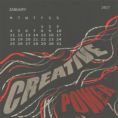
JANUARY
Design by: Rameen Khurram, Heriot-Watt University
"Creative Power appears here as raw, tangible energy. Distorted lines and typography show ideas breaking through, transforming constraint into creation. The design is shaped by the paper’s deep tone and tactile, organic texture. Its rough surface creates a moody backdrop that softens the contrast between the cream and red print.”
Printed on: Olin Origins Lava Stone, 240gsm
The Olin Origins range of papers and boards offers 5 timeless, earthy shades, all with a refined roughness yet subtly smooth touch. Inspired by nature, Olin Origins is carbon balanced via World Land Trust and a member of 1% for the Planet, dedicating 1% of its revenue toward non-profit, environmental organisations.
Find out more here.
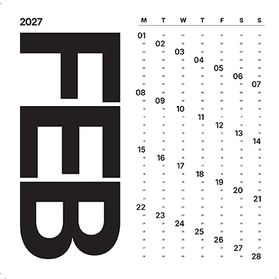
FEBRUARY
Design by: Liam Derrick, Edinburgh Napier University
“For this design, I created a fully modular asymmetrical grid system for the calendar layout in order to balance striking typographic visuals with a delicate, fine approach to the numbering system. The disciplined layout is imbued with a sense of stillness that highlights the paper stock, while the balance of visual elements and materiality conveys a story of seasonal change.”
Printed on: Conqueror Wove Oyster, 300gsm
Produced to exacting standards since 1888, Conqueror is recognised as the superior choice for brand identity. The unique touch and appearance have become the international standard for quality and the range is also renowned for its distinctive watermark. From whites to creams, the range includes consistent shades across all finishes including Wove, Laid and smooth CX22.
Find out more here.
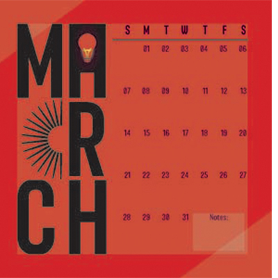
MARCH
Design by: Ruby Richardson, New College Durham
“I represented creation by transforming the letter ‘A’ into a glowing light bulb and sun, symbols of invention, energy, and growth. This suggests that creation brings both light and power. The red paper stock evokes the warmth of spring while also carrying strong psychological associations with energy and strength.”
Printed on: Olin Colours Poppy, 240gsm
Discover a world of opportunity with the 26 shades that make up the Olin Colours range spanning pastels, greys and high-pigmented, vivid colours. Mix and match colours to create impactful projects, all carbon-balanced as standard via World Land Trust.
Find out more here.
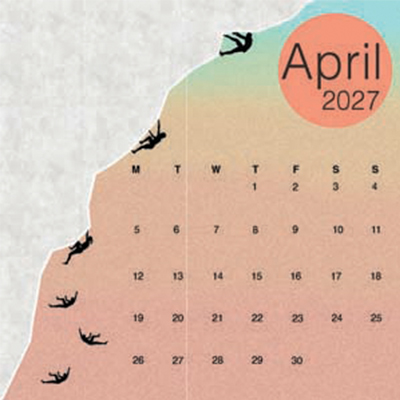
APRIL
Design by: Ibrahim Ahmed, London South Bank University
“Sinking Ground is a visual exploration of the accelerating crisis of melting icebergs. A descending sequence of silhouetted figures tumbles down a fracturing slope as the shifting colour palette evokes rising heat, reflecting the increasing intensity of a warming planet. The recycled fibres of the paper reinforce the work’s environmental message.”
Printed on: Refit Cotton Pearl, 250gsm
Refit is a fashion-inspired paper range made from 25% wool, cotton or denim waste that give the three finishes a distinctive look and feel. Refit is produced with 100% hydro-electric energy with the remaining carbon emissions offset through an alliance with Climate Partner.
Find out more here.
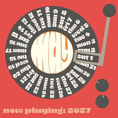
MAY
Design by: Isabella Kinver-Tait, Heriot-Watt University
“I wanted to centre the design a record player to appeal across generations, reflecting the revival of physical music for modern audiences while also resonating with those who grew up with vinyl. The rich Keaykolour shade of paper is bright and expressive, reflecting the artistry and character of music.”
Printed on: Keaykolour Match Tea, 300gsm
With a chromatically rich colour palette of 45 colours, the Keaykolour range consists of 9 colour families, each ranging from pastels to bright, halftones and profound hues to enable various mix and match options. Carbon balanced as standard via World Land Trust, Keaykolour is available in 120gsm to 450gsm weights, embossed 340gsm boards and an extra-rough finish.
Find out more here.
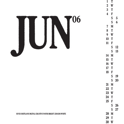
JUNE
Design by: Shean Ness, Edinburgh Napier University
“Rives creative paper stood out to me for its beauty, so I wanted the design to showcase it with clarity and restraint. I chose not to use illustration, instead focusing entirely on typography. The calendar is structured with the days of the week running down the centre, weekdays on the left and weekends on the right.”
Printed on: Rives Shetland Bright White, 250gsm
Rives Shetland has an unusual surface that subtly suggests the texture of fine woollen fabric. This textured paper is available in two shades of white (Natural and Bright), and in a choice of several grammages, all carbon balanced as standard via World Land Trust.
Find out more here.
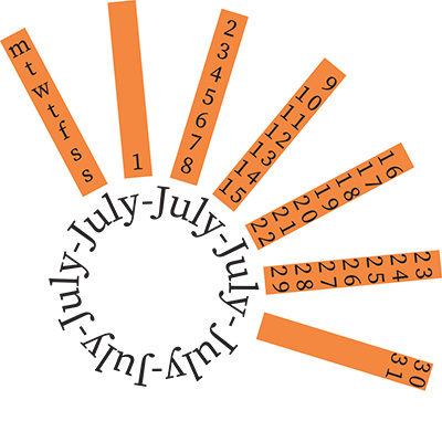
JULY
Design by: Eva Wood, Lancaster University
“This design expresses creative power through text manipulation that forms imagery. The month is conveyed through the image of a sun and the bright, playful paper choice.”
Printed on: Keaykolour Indian Yellow, 300gsm
With a chromatically rich colour palette of 45 colours, the Keaykolour range consists of 9 colour families, each ranging from pastels to bright, halftones and profound hues to enable various mix and match options. Carbon balanced as standard via World Land Trust, Keaykolour is available in 120gsm to 450gsm weights, embossed 340gsm boards and an extra-rough finish.
Find out more here.
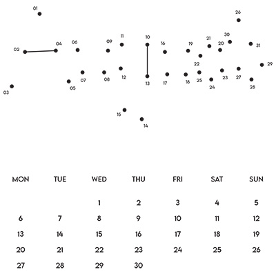
AUGUST
Design by: Shean Ness, Edinburgh Napier University
“This is an interactive calendar in which the title functions as a connect-the-dots drawing for the user to complete. Each dot represents a day of the month, so the image is built gradually, one day at a time. The grid system is kept deliberately simple to maintain focus on the title and paper choice”
Printed on: Olin Design Regular Ultimate White, 240gsm
Olin Design is a range of premium papers made up of Regular, Smooth and Rough finishes and 4 shades of white. With a premium, yet natural look and feel, this is a range of fine papers which provides a perfect matt print effect, while conveying a feeling of authenticity.
Find out more here.
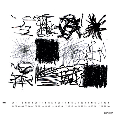
SEPTEMBER
Design by: Joanne Griffin, Edinburgh Napier University
“The idea behind my design is about the sensory experience of mark making, by allowing my mind to be set free. Creative Power to me is not just in my mind, but it’s freely expressed through my hands. My design represents the print age rather than digital media, its calming, beautiful and expressive.
Printed on: Curious Skin Grey, 270gsm
A surprisingly silky paper with a matt finish, Curious Skin is smooth to the touch with an incredibly uniform surface. Combining excellent printability and resistance to scuff and finger marks, the range is ideal for luxury packaging or invitations.
Find out more here.
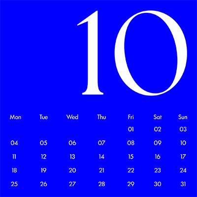
OCTOBER
Design by: Caroline Von Gregory, Edinburgh Napier University
“My design prioritises accessibility for visually impaired users while remaining clear and readable for sighted users. The Curious Matter paper stock enhances the tactile experience through its distinctively textured surface.”
Printed on: Curious Matter Adiron Blue, 270gsm
Developed to incorporate by-products from the industry, Curious Matter has a feel somewhere between silk and sand. Its colour palette ranges from neutral shades, such as Goya White and Andina Grey, to the intense Adrion Blue, Desiree Red and Black Truffle. Intriguing papers that will help your printed projects visually and sensorially stand out.
Find out more here.
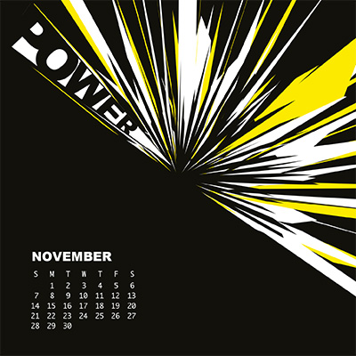
NOVEMBER
Design by: Safiya Lomas, Leeds City College
“My piece responds to the theme of Creative Power through an explosion of colour radiating from the centre of the page. The letters of “power” are distorted into a spark-like form, merging with the burst of energy. I introduced touches of yellow to emphasise vitality and strength without overwhelming the composition.”
Printed on: Olin Colours Black, 240gsm
Discover a world of opportunity with the 26 shades that make up the Olin Colours range spanning pastels, greys and high-pigmented, vivid colours. Mix and match colours to create impactful projects, all carbon balanced as standard via World Land Trust.
Find out more here.
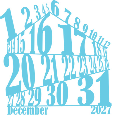
DECEMBER
Design by: Charlotte Oakley, Edinburgh Napier University
“This December design is playful and experimental. I varied the size of the dates to reflect their importance, such as the first day, the first full week, and the last day. Rather than following a strict grid, the layout embraces how chaotic the month can feel. The colour was chosen for its association with the colder season.”
Printed on: Curious Metallics Ice Gold, 300gsm
The Curious Metallics colour palette offers timeless and classy colours in contemporary shades: fundamental reds, blues, silvers and golds as well as neutrals and a deep black. The paper's structure and subtle gradations invite design possibilities across the shimmering colour palette.
Find out more here.